
This week was a journey through all the new and exciting things that developers are creating for their websites. There were so many wonderful websites to choose from, but below are the three that I found most fascinating for various reasons.
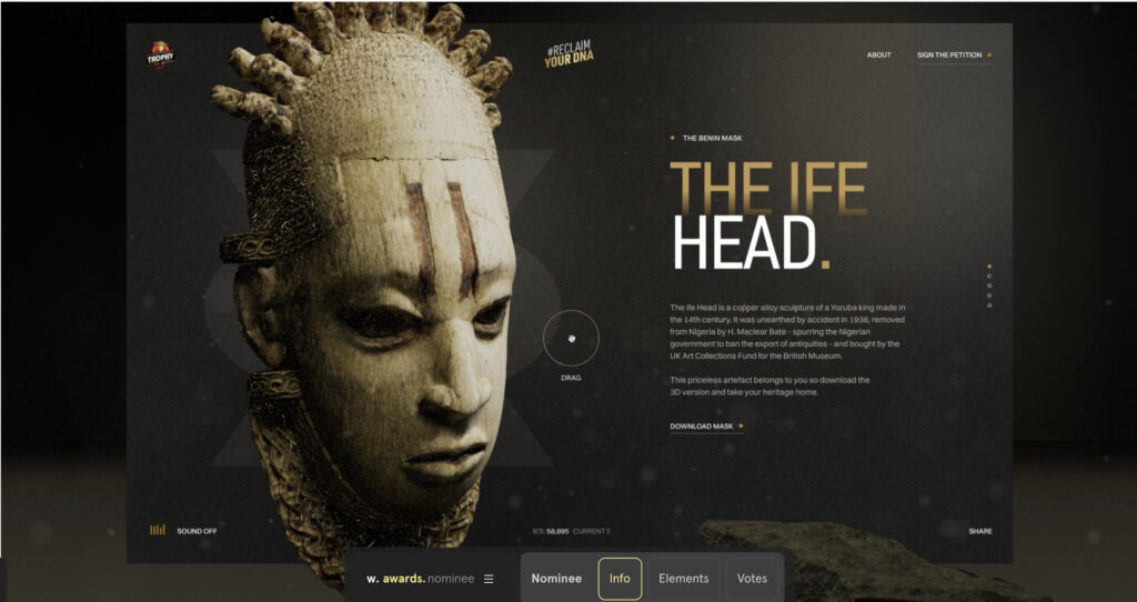
Reclaim Your DNA
This website gave me goosebumps. I had to vote and give these people a 9. I would have given them a 10, but I haven’t participated in the Awwwards site long enough to give those criteria. This dynamic website is not just a page, but they take you on a journey. The animation of the image of the head can be rotated, providing the user with a 3D view of the artifact. I love that I can look at it from all sides. When you go to the website, you’re locked into the blacks and the golds as they glitter across the screen. As they launch into the subject matter, we are taken on a cinematic journey of sensory delight. Oh hit the skip button…hit that little skip button on the bottom, and you can SCROLLLLLLLLLL through the 3D representation of the artifacts. I am transported from my kitchen table into a museum! How did they get them lined up like that across the screen? Once you choose your artifact, it gives the story behind the artifact, and you can still rotate that artifact 360 degrees. The site has amazing accessibility with its different sound options and ways the information can be processed for the user. This is my new favorite web design…the best example yet of what I want to create. I feel like Jack Frost I do, from that Disney movie…”What’s this? What’s this? There’s magic in the air…What’s This?” And I want to add just one more thing that makes this site so cool, I most likely would not have gotten the pleasure of seeing these things in real life or hearing this story, and now I walk away with knowledge of a chapter in our human history I didn’t know existed. This website impacted me and that is what I want my websites to do for clients and users.
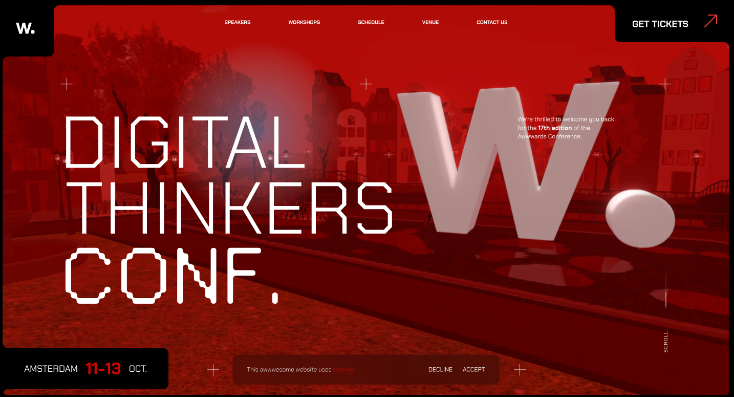
Digital Thinkers Conference
I love it, I love it, I love it…And Im not giving it away here. Go ahead and click that link first and see for yourself. The animation is so cute and delightful. It’s so neat how the navigation is interactive. I love the colors, I love the typography. It made me feel all warm when that thought came to mind analyzing the website. I may be wrong a lot, but at least I am starting to think like a front-end developer. I also like the way they presented their content. They have only the basic important information presented first. Digital Conference…Thinkers…the date and the city. I want to know how they arranged those elements to present this way. I see about 10 different elements between the nav, the animations, and the headings. I chose this website because when I get more time I want to go back and inspect this layout to see what they did. Very nice job.
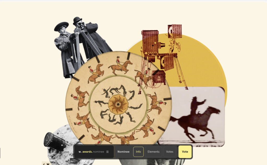
Kirkland
The interactiveness of this website nailed it. They just nailed it. I love the images first of all. The whole point of the website is to educate users on the history of cinematography and how AI technology is evolving it. I am having a blast just scrolling through their animations. The images do all types of things when you scroll through them, almost like clicking a remote and changing the channel. I have to know how they did that. Every finger scroll gives a little snippet of animation with several images. That was brilliant. It’s like they are connecting all the concepts of watching cinema with the actual design of the website. The Awwwards site is a valuable resource because the developers of the websites give you the concepts of their layouts to pour through. A How we did it if you will. I like that. I like that a lot. This website has given me quite a bit of inspiration for future projects.
Thoughts for my fledgling webpage:
I promise myself I wouldn’t go back and redesign my wheel this week. My itty bitty static client website as of now meets all those must-have requirements for the grade. I got my background image, I have my fonts, my hex colors, my buttons to nowhere, and my images. I promised myself not to start all over again, but I am so unhappy with it. I started by committing the ultimate designer sin of using the box model for spacing and design of the layout. That cost me about 3 days of why isn’t this working. The background is still too bright, even with the blend-mode-lighten. My parent, sibling, and child tags are in the middle of a big family brawl over which rules apply to who. I think my divs are multiplying and randomly asserting themselves in the HTML. I’ve still got a laundry list of tweaks and twerks. I know myself so well, that when I submit it for the final, I still will not be happy. So here’s what we are going to do. We are going to submit it, as we are, after twerks and tweaks. Then, over the next few weeks, as these new concepts become more of a habit for me, rather than a challenge, I will go back and add my little bumble bee with the fluttering wings for some cute animation. Keyframes are the keyword here. I’ll go ahead and make my little nav buttons go to the indoor crafts and outdoor crafts. I can create a little indoor and a little outdoor page within my client folder, then set them up as internal links. or maybe go find some external URLs to fit, who knows? I want to make this client page a gift for my partner. It won’t be ready for the standards I have in my mind by ship date. Thats ok. I will just go back again and again until I meet those standards. I want to bring this alive for her, so she can add this as a collaboration to her portfolio. She was the inspiration for the design, I want to bring her idea to life and watch it flutter across the screen. In ten years, I want her son to be able to look at that page, to see how hard she was working on getting their future in order. That is really the goal of my Client Page. My client’s satisfaction. Not mine.


Leave a Reply